
January 30, 2024
Question

Grid Field Rows with Expandable/Collapsible Section
  • January 30, 2024
  • 8 replies
  • 1 view

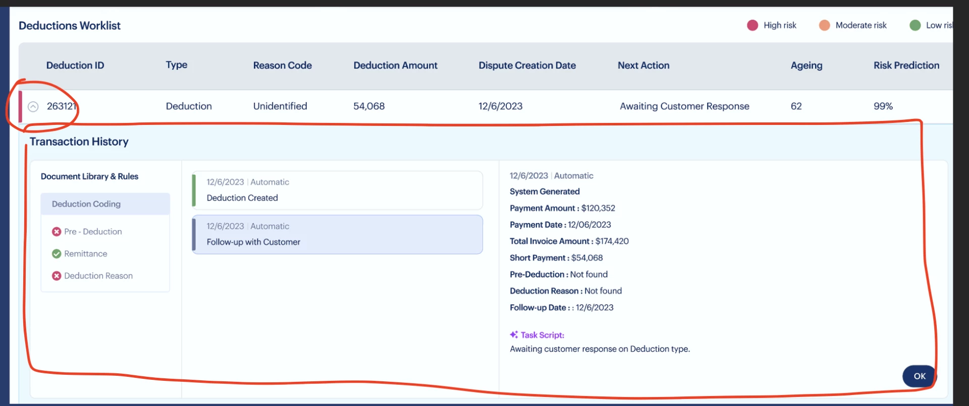
Hi! Has anyone implemented an interface with a similar visual style? A grid field with rows and the rows have an icon that when you click expands a section.

I could be wrong, but I think Appian doesn't currently have an out-of-the-box component/layout for this, hence I'm trying to find a workaround. 

I am looking for ideas on how I can at least mimic a fraction of this style in Appian.

8 replies

harshitb6843
January 30, 2024

Try this. 

a!localVariables(
  local!expandedIndex,
  a!forEach(
    items: enumerate(10),
    expression: {
      a!cardLayout(
        contents: {
          a!richTextDisplayField(
            labelPosition: "COLLAPSED",
            value: {
              a!richTextItem(
                text: fv!index
              )
            }
          ),
          a!sectionLayout(
            showWhen: tointeger(local!expandedIndex)=fv!index,
            label: "Transaction History"
          )
        },
        link: a!dynamicLink(
          value: if(tointeger(local!expandedIndex)=fv!index,null,fv!index),
          saveInto: local!expandedIndex
        )
      )
    }
  )
)

stefanhelzle0001
Brainy
January 30, 2024

There is no OOTB component, but you can easily built such.

January 31, 2024

This is how they want it to look. They want to show/hide the section below the selected row itself and still list the unselected ones.

stefanhelzle0001
Brainy
January 31, 2024

OK. Appian does not support that in the OOTB grid component. But you could build a custom grid using columns layouts and then do whatever you want or need to do.

IMHO, I would try to challenge that requirement and try to find a solution that provides the same UX but using a slightly different UI. Staying with the OOTB components saves you a ton of effort and ensures a more consistent UI across apps.

abhayd3663
February 2, 2024

As suggested by other members, no OOTB component to address this requirement, however it can be built easily by using other components with show/hide on condition. 

February 5, 2024

Yeah, I've built a custom grid (image below). But I think the level of effort to maintain/scale this would be higher compare to when we use an OOTB component and I also think that this kind of design is not ideal for large grids, not sure how it would accommodate large number of columns.


abhayd3663
February 5, 2024

Absolutely!