

vinayj6479
January 16, 2024
Question

Is there any limit for data label for pie chart?

  • January 16, 2024
  • 7 replies
  • 0 views

Hi team,

i have requirement to implement a donut style of pie chart. everything is fine expect the data labels. it is not showing complete label name in the legend.

a!pieChartField(
  label: "Employee Credential Status",
  labelPosition: "ABOVE",
  series: {
    a!chartSeries(label: "off boarding or termination of client", data: 1374, color: "BLUEGRAY"),
    a!chartSeries(label: "making account to non billabale", data: 343, color: "AMBER"),
    a!chartSeries(label: "updated accouts to check pay", data: 97, color: "RED")
  },
  height: "SHORT",
  seriesLabelStyle: "LEGEND",
  colorScheme: "CLASSIC",
  style: "DONUT",
  showTooltips:true,
  showDataLabels: true,
  showAsPercentage: true
)
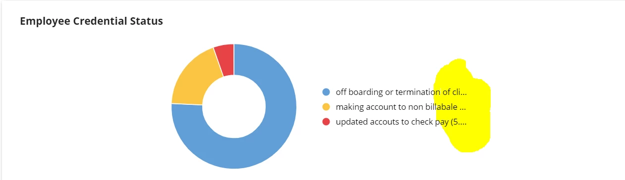
The requirement is to show complete label in the legend. 

7 replies

harshitb6843
January 16, 2024

I don't think you can do that. It is how this chart works. 
You can either change the position of these legends or switch to Google charts.

rishikeshr4182
January 16, 2024

You can try "ON_CHART"  in seriesLabelStyle. 


rishikeshr4182
January 16, 2024

You can aslo try this custom-made LEGEND.

a!columnsLayout(
  alignVertical: "BOTTOM",
  columns: {
    a!columnLayout(
      contents: a!pieChartField(
        label: "Employee Credential Status",
        labelPosition: "ABOVE",
        series: {
          a!chartSeries(
            label: "off boarding or termination of client",
            data: 1374,
            color: "BLUEGRAY"
          ),
          a!chartSeries(
            label: "making account to non billabale",
            data: 343,
            color: "AMBER"
          ),
          a!chartSeries(
            label: "updated accouts to check pay",
            data: 97,
            color: "RED"
          )
        },
        height: "SHORT",
        seriesLabelStyle: "NONE",
        colorScheme: "CLASSIC",
        style: "DONUT",
        showTooltips: true,
        showDataLabels: false,
        showAsPercentage: true
      )
    ),
    a!columnLayout(
      contents: {
        a!sideBySideLayout(
          items: {
            a!sideBySideItem(
              width: "MINIMIZE",
              item: a!richTextDisplayField(
                value: a!richTextIcon(icon: "circle", color: "#E8CD31")
              )
            ),
            a!sideBySideItem(
              item: a!richTextDisplayField(
                value: a!richTextItem(
                  text: "off boarding or termination of client"
                )
              )
            )
          }
        ),
        a!sideBySideLayout(
          items: {
            a!sideBySideItem(
              width: "MINIMIZE",
              item: a!richTextDisplayField(
                value: a!richTextIcon(icon: "circle", color: "#EB2700")
              )
            ),
            a!sideBySideItem(
              item: a!richTextDisplayField(
                value: a!richTextItem(text: "making account to non billabale")
              )
            )
          }
        ),
        a!sideBySideLayout(
          items: {
            a!sideBySideItem(
              width: "MINIMIZE",
              item: a!richTextDisplayField(
                value: a!richTextIcon(icon: "circle", color: "#64A8D9")
              )
            ),
            a!sideBySideItem(
              item: a!richTextDisplayField(
                value: a!richTextItem(text: "updated accouts to check pay")
              )
            )
          }
        )
      }
    )
  }
)

harshitb6843
January 16, 2024

A couple of observations in your code. 

  1. The colors of the pie chart are not the same as the colors of the legends. Hence, it is better to have a single source of truth (a variable).
  2. You need not add icons and the text is two separate side-by-side items. Both can be added in a single richTextDisplayField

Below is an optimized version of your code. 

a!localVariables(
  local!data: {
    {
      label: "off boarding or termination of client",
      data: 1374,
      color: "#619ed6"
    },
    {
      label: "making account to non billabale",
      data: 343,
      color: "#fbc543"
    },
    {
      label: "updated accouts to check pay",
      data: 97,
      color: "#e64344"
    }
  },
  a!columnsLayout(
    alignVertical: "MIDDLE",
    columns: {
      a!columnLayout(
        contents: a!pieChartField(
          label: "Employee Credential Status",
          labelPosition: "ABOVE",
          series: a!forEach(
            items: local!data,
            expression: a!chartSeries(
              label: fv!item.label,
              data: fv!item.data,
              color: fv!item.color
            )
          ),
          height: "SHORT",
          seriesLabelStyle: "NONE",
          colorScheme: "CLASSIC",
          style: "DONUT",
          showTooltips: true,
          showDataLabels: false,
          showAsPercentage: true
        )
      ),
      a!columnLayout(
        contents: {
          a!forEach(
            items: local!data,
            expression: a!richTextDisplayField(
              labelPosition: "COLLAPSED",
              value: {
                a!richTextIcon(
                  icon: "circle-large",
                  color: fv!item.color
                ),
                " ",
                a!richTextItem(text: fv!item.label)
              }
            )
          )
        }
      )
    }
  )
)

stefanhelzle0001
Brainy
January 16, 2024

Besides the other ideas, you could also switch off the legend and create a custom one, using rich text display fields.

rosiew5577
January 17, 2024

Yayyy. It allows for more flexibility and customization in how the legend is displayed.

Connections Game

harshitb6843
January 17, 2024

Yayyy. You are a SPAMMER!!!