
July 16, 2021
Question

create an average line in a report

  • July 16, 2021
  • 4 replies
  • 0 views

Hello.
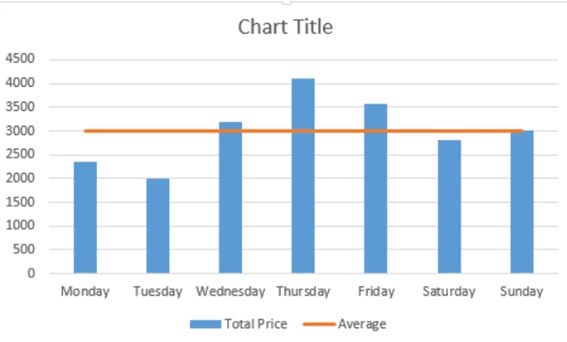
I am creating a column chart that shows me the companies created in a period of time, this part is done. But now I need to create an average line in the report that shows me the average number of companies created in a year. It is possible to do it in Appian, I am new and I do not know if it can be done. 
    4 replies

    raulg0003Author
    July 16, 2021

    this is what you would need to do

    gayathris111098
    July 16, 2021

    You can use the Google Charts Plug-in to achieve it. It bundles a lot more intuitive charts.
    Find it here - https://community.appian.com/b/appmarket/posts/google-charts-component-plug-in

    peter.lewis
    Employee
    July 16, 2021

    You definitely can do this - as suggested by others, a reference line allows you to add a line and style it to the chart accordingly. The tricky part is that a reference line expects to receive a value, but it cannot automatically calculate the average. So to configure this, you will likely need to query the data, calculate the average in a local variable, and use that calculated result to display the line.