Solved
How to Make Stacked Column Chart with Multiple Series?
Hi Appian Community!
I have a requirement where in the column chart below, I need to show a breakdown of the data for each bar of all the series based on the date.
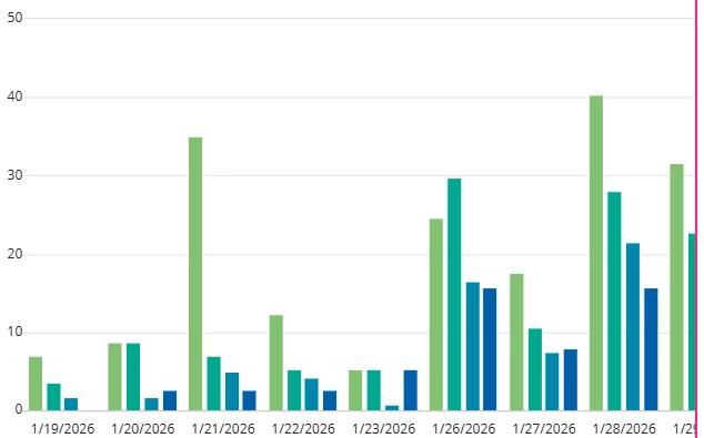
I had to manipulate the dataset so using a record type was not possible. Now I have my data structured where x-axis is dates, and y-axis is the percentage of each area of the office's seat booking. How do I show within each bar, a breakdown of say half is booking type A and the other half is booking type B?