

mikes0011
Brainy
December 7, 2022
Question

22.4 Feedback - major overhaul to process modeler has removed Grid Lines by default

  • December 7, 2022
  • 47 replies
  • 0 views

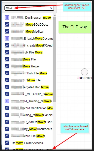
First let me start this off with some good news.  The left-hand object bar has been further tweaked and reorganized.  I previously commented that "process model / interface search results" being at the top of the list (as they are in 22.3 and lower) makes it harder to access the Smart Service Nodes we're after when that's what we're actually searching for.  It looks like they listened! Yay!
But for the main point of this post: i've noticed that Grid Lines are now turned off by default and there is no way to undo this except by turning them on manually every single time you load a process model.
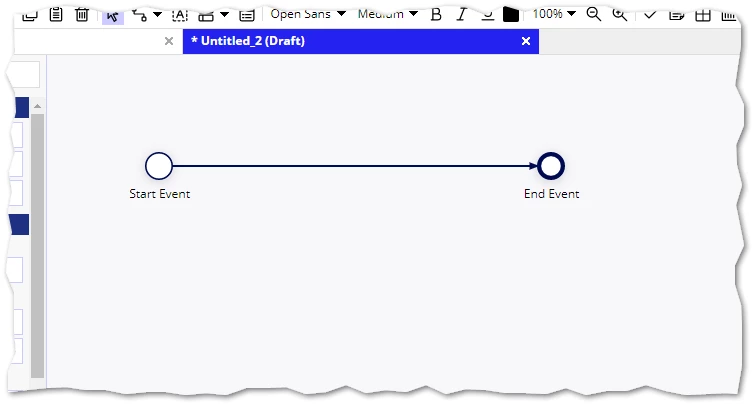
At first I was hoping this was a bug in my Community Edition instance, or some incomplete feature or temporary break.  But other users are now posting screenshots from 22.4 versions around community and it seems like it may have been "intentional".

Hey Appian folks?  This may have been intended to "look cleaner" or something - but to me, psychologically, it makes me think something hasn't loaded correctly.  As far as I know, with as long as I've been looking at process models with grid lines, I anticipate this effect will last a long time.

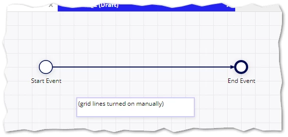
I see they're still there.  They're redesigned but I guess I don't have any major qualms with the newer, simplified grid lines (i'll paste an example below for everyone's reference).  Can we just have them turned back on by default?  Could it at least be given as an override in designer user-level preferences or something?
I know the product backlog is huge, lots of higher-priority stuff, etc.  But I think this is something that wasn't necessary to change.

    47 replies

    mikes0011
    mikes0011Author
    Brainy
    December 7, 2022

    If anyone from Appian sees this anytime soon, here's a non-exhasutive list of Process Modeler quality-of-life features that I've been tracking for a long time now (not 22.4-specific of course), but all of which would improve designers' experience anywhere between "small but frequently helpful upgrade" to "dramatically better" (imho).

    • The very continued existence of Single-Line expression boxes (where a multi-line expression can be written, but which will be collapsed to one upon saving) is ... flabbergasting.  I can't even accurately put into words how frustrating this is.
    • The modeler Title Bar (the dark-blue area next to the "Appian Process Modeler" label) continues to be a large, empty, waste of screen space, which could be repurposed to show some helpful information about the Currently-Open Model / Instance, which is quickly obscured in the Tab header once a lot of tabs are open.  Instead, when monitoring many open process instances, I'm forced to mouse-over the tab and read the pop-up-text, even to tell which instance i'm CURRENTLY on.
    • Right-clicking on Flow Lines should show standard functionality (chaining, labels, etc) FIRST, and then "suggested nodes" after that.
    • The Right-Click Menu itself can easily be obscured by the Messages Panel for objects at or near the bottom of the process model.
    • Variables in Expression Editor: welcome (re-)Addition, however they leave a little bit to be desired.  What is the data type of this CDT field?  Is this PV a single or array item?  Currently there's no way to tell, and these should be available at-a-glance.
    • Process Model [Generated] Documentation: there is no way to see values configured as interface inputs on the Forms tab of User Input Tasks.  Particularly when passing PV values or expression-calculated values into interfaces for read-only purposes.  That means if a PV is used only in a Form input (directly), it will not be seen at all in the generated documentation.
    • For the Process Instance Editor: there's no reason the "CTRL+S" hotkey shouldn't save the instance edits (like it already works in the model editor).

    If anyone else agrees or has suggestions on any of the above, please upvote / comment / let me know otherwise somehow.  Or should each of these just be submitted as individual support cases?

    The Expression Guru
    davel001150
    December 8, 2022

    Just some quick work they could do on default behaviors:

    1.  Make Alerts default to sending only to the administrators of THAT process model.  There may be some folks for which that is OK, and some that still want to change default, but nobody wants Alerts to go to every last developer on the environment.

    2.  Make "Save Draft" on User Input nodes default to unchecked instead of check.  The amount of effort across all Appian developers to repeatedly uncheck the same box for every interface made dwarfs the effort  to check the box when they want to use that feature.

    Also, some really nice features would be if the lines didn't have to overlap as hard as possible, which gets especially annoying when only 1 of several overlapping lines doesn't have an activity chain, and you need to find it.  Also, on debug, it would be super awesome to have some visual cue for how many times a process flow flowed over the same line.

    Also, restart gateways.

    mikes0011
    mikes0011Author
    Brainy
    December 8, 2022
    nobody wants Alerts to go to every last developer on the environment.

    Or that one VP who insists on having an Admin account in TEST that he never touches anyway, but still gets all alert emails for...

    The Expression Guru
    mikes0011
    mikes0011Author
    Brainy
    December 8, 2022

    Paging [mention:67a4a894916f4848bcf20b541a8d00be:e9ed411860ed4f2ba0265705b8793d05] in case that might help get some eyes from Appian on this thread [emoticon:c4563cd7d5574777a71c318021cbbcc8]  (Thanks again for your feedback on my older thread for the Global Search behavior regression introduced in 22.3, btw).

    The Expression Guru
    mikes0011
    mikes0011Author
    Brainy
    December 9, 2022

    Updating this to add (instead of cluttering community with another top-level post, though in this case i'm *sorely* tempted) - the 22.4 update's new Process Modeler nodes completely ruin the look of icons from Plug-in Smart Services.  How did this pass testing?

    Before:

    Now:

    (note how bad the bottom-row node icons look...)

    The Expression Guru
    davel001150
    December 9, 2022

    I give that a pass.  Plenty of other things to develop first so I can at least stop looking at bad icons faster.

    mikes0011
    mikes0011Author
    Brainy
    December 9, 2022

    I dunno, it seems to me as if they could've at least made the existing icons scale properly in the middle of the new-style icon with dark blue rectangular border, to match the other ones.  I'm not sure what (if any) design process was involved here.

    The Expression Guru
    December 28, 2022

    Wanted to follow-up one more time on this post, and to let you know that the feedback here has been shared with product managers at Appian. We've thought about many of the enhancements in this thread and have received similar feedback before. In regards to some of the subjective UX feedback, I'll continue to monitor that over the next few weeks before reverting any changes.

    We are doing a lot of exciting work this upcoming year and I'll be sure to reach out for some feedback in an upcoming quarter. Happy holidays!